⚡
Useful on day one
No warehouse, no data model, no analyst. The standard metrics are live as soon as onboardings run.



What you get out of the box. No premium tier.
No warehouse, no data model, no analyst. The standard metrics are live as soon as onboardings run.
Platform events land live, connected systems as fast as they allow. One coherent state, never a fresh number beside a stale one.
Duration per phase, per client — so you see where onboardings sit longest instead of reading one number for the whole portfolio.
From signal to outcome in four explicit steps, with no hidden hand-offs.
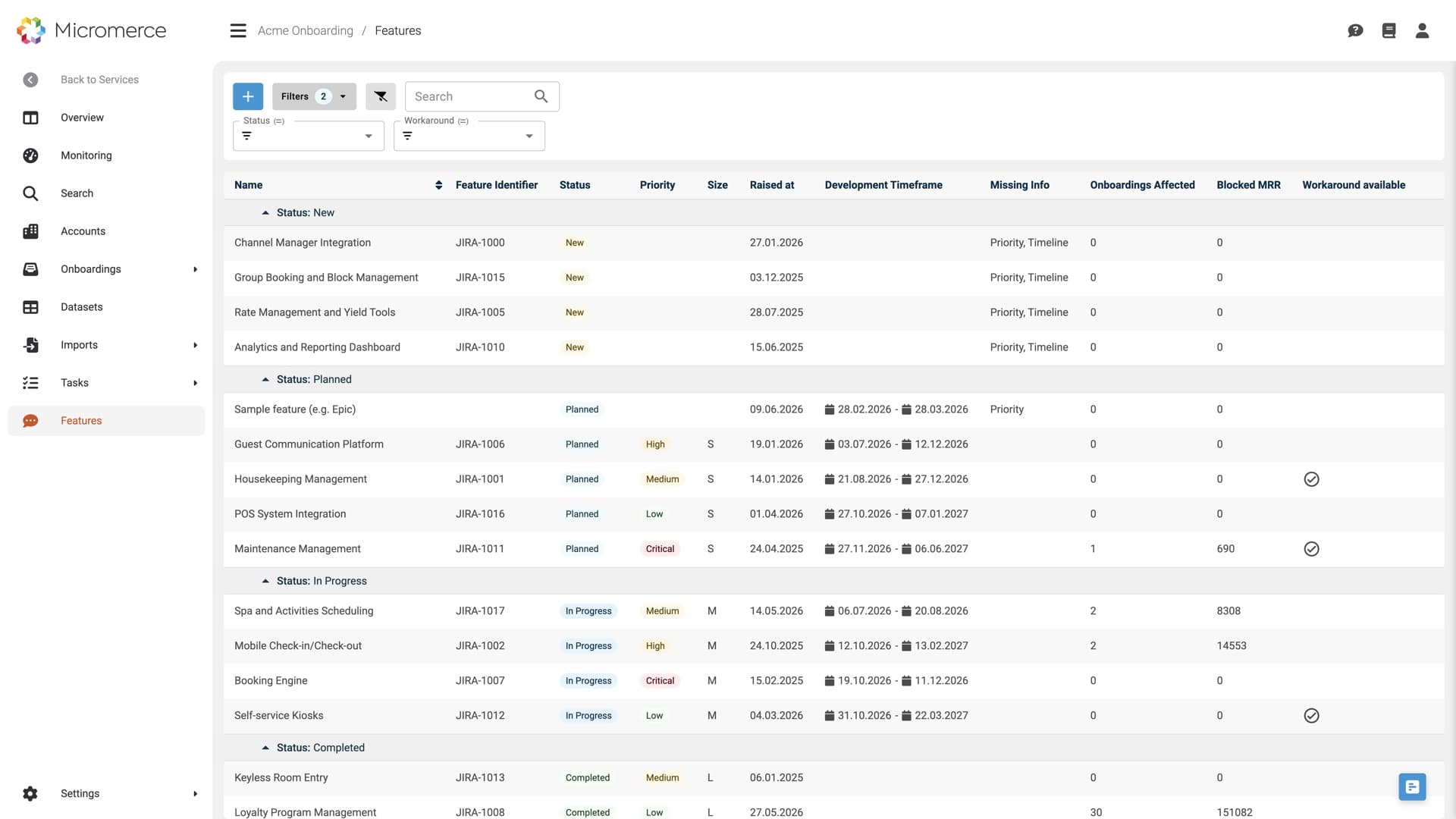
The platform's own record of onboardings and migrations, joined with your CRM for the commercial picture and your roadmap trackers for what engineering still owes. One 360° view of the customer.
Platform events aggregate as they happen. Connected systems come in as fast as they permit: pushed on change, or pulled on a fixed interval. The aggregation keeps them aligned.
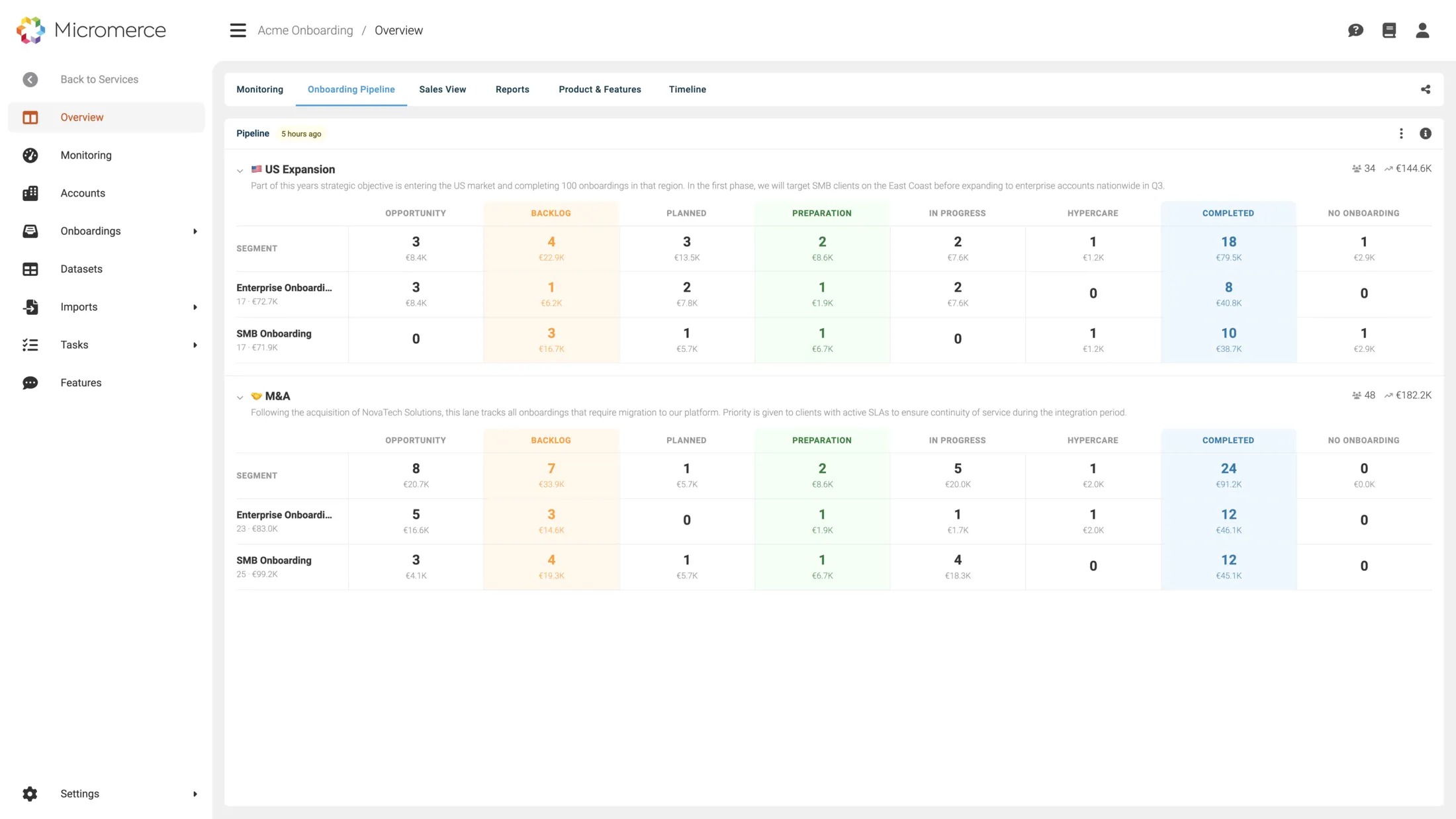
Monitoring and forecast, pipeline by segment, the sales funnel ahead of delivery, and reports on what is blocking go-live. Duration is broken out per phase, not just per onboarding, so a delay points at the step it is sitting in.
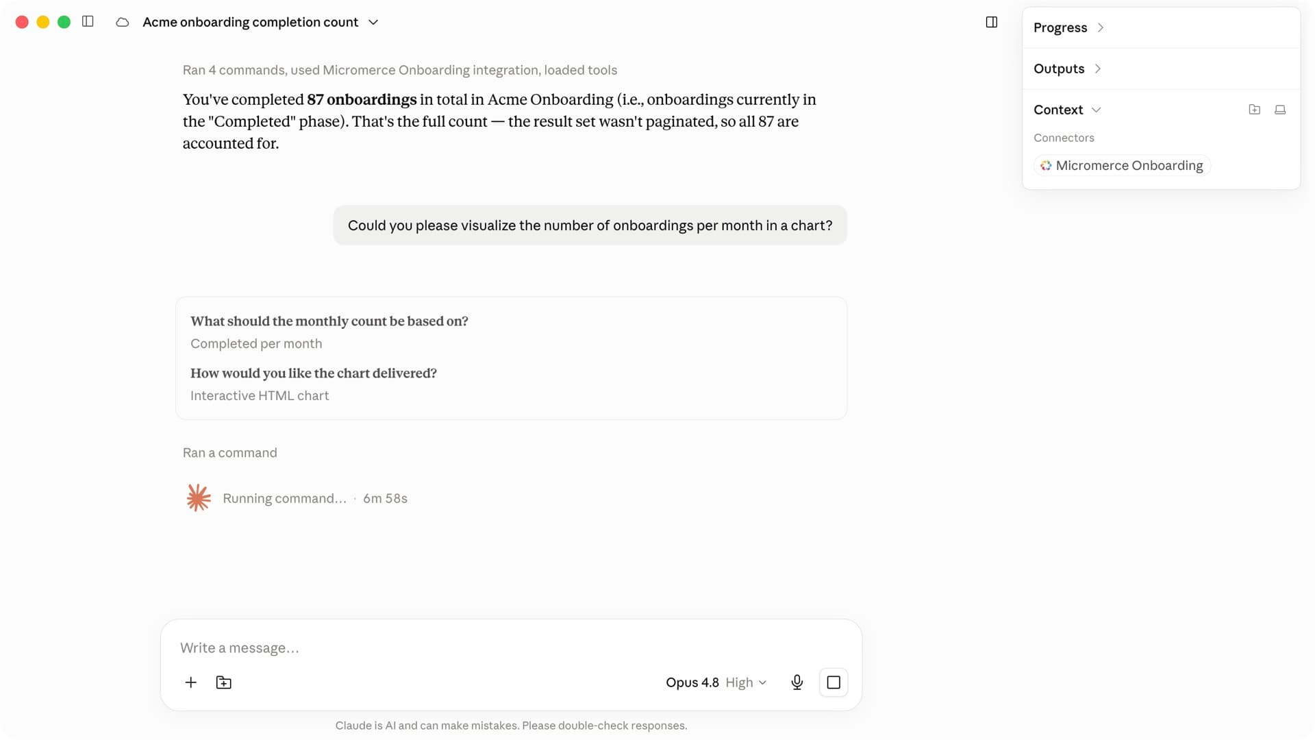
The built-in assistant answers it, or your own AI through the MCP endpoint. Results go out as PDF or CSV, into the customer's portal, or via the API.
Every headline backed by a concrete workflow. Screenshots show what your team will actually use.
Throughput and time to go-live, revenue in flight, customer experience score, workload across the team, and whether the planned load still fits your capacity. Nothing to configure first.
Enterprise against SMB, organic growth against an acquired base, this quarter against last. An average across everything hides exactly the segment that is slipping.
30-minute call. Tell us which question your reporting cannot answer today, we show you where it sits.
Deals from Salesforce or HubSpot arrive with stage and win probability. What is still a forecast in sales is already a capacity question in delivery.
Quarterly figures as PDF or CSV for the board, progress per customer in their own portal, and the validation report with match rate and discrepancies per data type. Data quality reported, not asserted.
The one-off question from the board, the cut nobody anticipated: put it to the built-in assistant, or to Claude, ChatGPT or Cursor through MCP. Same data, no widget to build.
Anonymised from our customer base. See whether one of them is yours.
The next quarter's onboardings were committed in sales without anyone checking whether the team could absorb them.
Planned load against available capacity in one chart. The conversation about hiring or sequencing happens before the commitments, not after.
One overall completion rate looked healthy while a single segment quietly fell behind for two quarters.
Segment-level view surfaced the gap between Enterprise and SMB early enough to change the flow rather than apologise for it.
Quality stays a black box until the end. The customer is asked to trust that their data is right, and finds out whether it was only once they are live on it.
The report sits in their portal from the first test import and updates with every run. They see the match rates move, flag problems in time, and sign off on numbers they already know.
Not every alternative disappears — but most of the work behind them does.
Other parts of the platform you'll use alongside this.
Progress and throughput, time to go-live and how long each phase takes, revenue in flight and which phase it has been sitting in and since when, customer experience score, team workload, capacity against planned load, pipeline and win probability from your CRM, acquisition progress, and data quality per data type. Live as soon as onboardings run.
There is no widget builder, and it is rarely missed: the standard views come out of 10,000+ onboardings and cover what matters week to week. For the one-off cut, you ask the built-in assistant or your own AI.
From the platform itself, joined with your CRM for deals and win probability and your roadmap trackers for the features a customer waits on. Revenue figures are the values carried on those records, not billing data from your target system.
Platform figures update as events arrive. A connected system is as current as it allows: pushed on change, or polled on a fixed interval. The aggregation keeps the view consistent, so you never compare numbers of different ages.
Yes. Progress and readiness for their own onboarding appear in their portal, in your branding. The client portal page shows what that looks like from their side.
As PDF or CSV for a board pack, and via the API into your own systems. There is no packaged Snowflake or BigQuery connector.
30-minute call. Bring an onboarding you are running today, we show you where the time goes.

We use cookies!